Google Fonts offers many typefaces to improve website design and readability. Its extensive library includes high-quality, open-source fonts optimized for performance and accessibility, making it a go-to source for free fonts for modern UI. Integration is straightforward, ensuring consistent typography across different devices and web browsers. Whether aiming for a modern, professional look or a unique, playful design, Google Fonts provides the resources to enhance your site’s visual appeal and user experience.
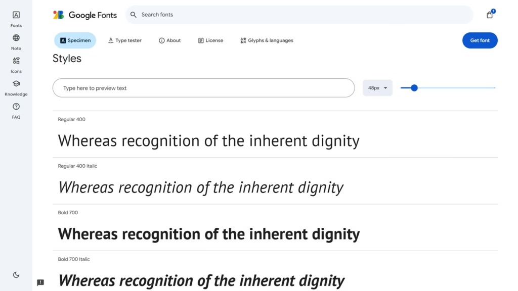
Alegreya
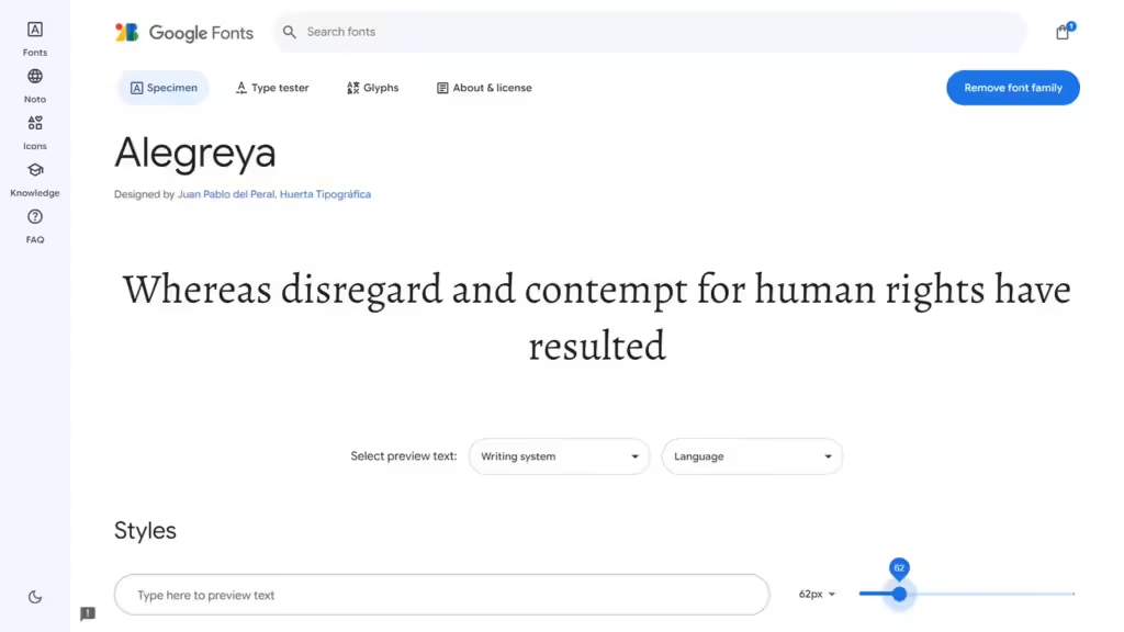
Alegreya is an elegant serif typeface designed by Juan Pablo de Gregorio and developed by Huerta Tipográfica. Its design was inspired by the rhythms and proportions of classic book typography, making it well-suited for both print and digital media. Alegreya is known for its dynamic and readable letterforms, which enhance the flow and readability of text in various applications. The typeface supports a wide range of languages and includes a comprehensive set of glyphs, making it a popular choice for diverse content.
Features:
- Energetic Letterforms
- Sophisticated Serif Style
- Extensive Glyph Collection
- Clear and Readable
- Flexible Weights
DM Sans
DM Sans is a modern, geometric sans-serif typeface created by Colophon Foundry and featured in the Google Fonts library. Its design prioritizes high legibility and geometric precision, ensuring clear, readable text across various applications. The typeface’s clean, geometric lines and balanced proportions make it highly versatile, suitable for both digital interfaces and print media. With its focus on clarity and contemporary aesthetics, DM Sans enhances the visual impact and readability of any design project.
Features:
- Excellent Readability
- Geometric Style
- Extensive Language Coverage
- Free to Use
- Varied Weights
Inter
Inter is a highly legible, modern sans-serif typeface designed by Rasmus Andersson. Developed with digital readability in mind, Inter is crafted to perform well on screens of all sizes and resolutions. Its clean, geometric design and wide range of weights make it ideal for a variety of digital applications, from user interfaces to long-form reading on websites. Inter is open source and freely available through Google Fonts, reflecting a commitment to accessibility and versatility in design.
Libre Franklin
Libre Franklin is a modern, flexible web font that combines classic American typeface design with digital functionality. Ideal for contemporary use, it excels in providing strong typographic support for websites. With extensive coverage for Latin-based languages and support for non-Latin scripts like Greek, Cyrillic, and Arabic, it’s perfect for multilingual sites. Its broad character set and clear readability ensure a consistent, professional look across various languages and applications.
Lato

Lato is a standout sans-serif typeface created by Adam Twardoch, Botio Nikoltchev, and Łukasz Dziedzic. Its name, “Lato,” which means “summer” in Polish, reflects its warm, inviting design. Known for its clarity and adaptability, Lato is a top choice on Google Fonts for body text, suitable for both digital and print media. With 18 different weights, from thin to black, it offers great typographic flexibility. Its clean lines and professional look make it ideal for web design, branding, and editorial projects.
Lora
Lora is an elegant, modern typeface that blends traditional serifs with contemporary sans-serif elements. This distinctive combination creates a versatile font ideal for various design projects. Its slightly condensed characters enhance the visibility of headings and key visuals while maintaining excellent readability. Suitable for both print and digital media, Lora is perfect for editorial layouts, websites, and branding, offering a sophisticated and professional look across different applications.
Montserrat
Montserrat is a widely acclaimed modern typeface created by the renowned graphic designer Julieta Ulanovsky. Its design is inspired by the urban typography of Buenos Aires, blending contemporary style with classic influences. Montserrat is highly versatile, making it a popular choice for diverse design projects. It includes 36 different styles, ranging from thin to black, along with corresponding italics, providing ample flexibility for various typographic needs.
Nunito
Nunito is a modern, rounded sans-serif font designed by Vernon Adams, recognized for its soft yet highly readable design. Originally a display font, Nunito has expanded into a versatile typeface with both regular and extended versions, offering weights from light to extra bold. Its clean, approachable look makes it perfect for web, mobile interfaces, branding, and editorial work. With rounded letterforms and smooth curves, Nunito combines a welcoming aesthetic with excellent legibility, making it a top choice for both headings and body text in digital and print formats.
Open Sans
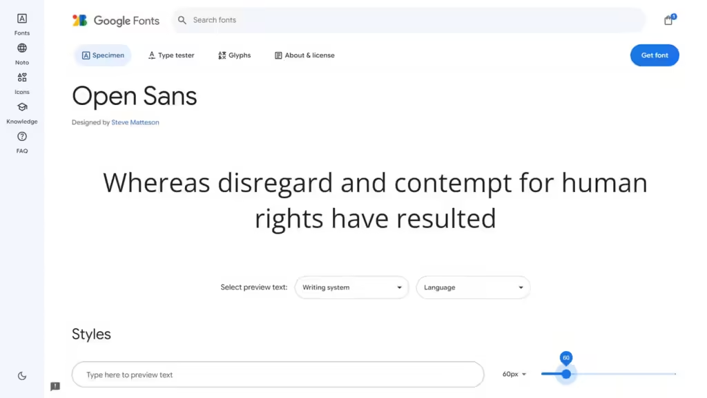
Open Sans, designed by Steve Matteson, is a highly popular sans-serif typeface known for its clean and minimalistic style. Optimized for legibility, it’s perfect for body text, smaller paragraphs, and user interfaces. Its open letterforms and generous spacing ensure excellent readability across digital and print formats. With 13 styles ranging from light to extra bold, plus matching italics, Open Sans offers great versatility for various design projects. Widely used in web design, mobile interfaces, and corporate branding, it combines professional appeal with adaptability.
Oswald
Oswald, designed by Vernon Adams, is a versatile sans-serif typeface available in seven weights: extra light, light, regular, medium, semibold, bold, and heavy regular. Inspired by classic gothic styles, it has been optimized for modern digital use with condensed, upright letterforms that save space. Oswald’s bold design makes it ideal for headlines and headings, capturing attention while maintaining legibility. It pairs effectively with lighter fonts, creating a visually balanced contrast. Due to its versatility and readability, Oswald is widely used in web design, editorial layouts, and branding projects.
Playfair Display
Playfair Display is a refined serif display font with bold, striking lines and a modern touch, perfect for headlines and titles. Inspired by transitional serif styles, it blends classic elegance with contemporary design. Its slightly condensed characters, open apertures, and rounded terminals enhance legibility at smaller sizes. This design ensures Playfair Display remains impactful in both large and small text applications. Versatile across editorial layouts, branding, and advertising, it adds a sophisticated touch to any project.
Poppins
Poppins is a contemporary typeface favored by designers for its sleek, minimalist design and geometric structure. Its clean, modern look is ideal for bold headlines, titles, and prominent text. With 18 styles ranging from thin to black, Poppins offers versatile typographic options. Designed by Jonny Pinhorn and Ninad Kale, it pairs well with contrasting backgrounds, ensuring strong visual impact and readability. Its adaptability makes it suitable for web design, branding, and advertising.
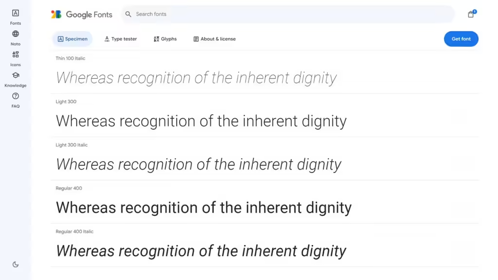
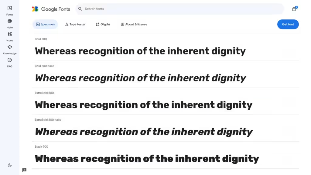
Raleway
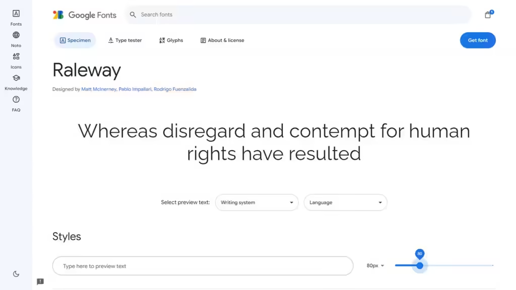
Raleway is a sans-serif typeface designed for clear readability on screens. It features open letterforms that enhance legibility. The font includes a wide range of weights and widths, as well as various stylistic options like swashes, ligatures, fractions, old-style numerals, arrows, and circled letters. These features offer designers flexibility to create dynamic and versatile designs. Ideal for both digital and print applications, Raleway combines elegance with functionality.
Roboto
Roboto is a web-safe typeface developed by Google for uniform use across Android devices and its services. Created by Christian Robertson, Roboto replaced the Droid font with a more polished and modern look. The font combines geometric shapes with open curves, giving it a clean, contemporary feel. Its versatility and readability make it a go-to choice for graphic designers in both digital and print media. If you use a OnePlus device or Google services, you’re likely encountering Roboto regularly.
Rubik
Rubik is an adaptable sans-serif typeface ideal for website headings and titles, especially when paired with traditional serif fonts for body text. The family includes nine weights, from thin to bold, and offers extensive OpenType features like stylistic alternates, ligatures, and fractions. This combination provides both legibility and creative flexibility. Rubik’s modern, clean design enhances visual hierarchy and suits a wide range of design applications.
Noto
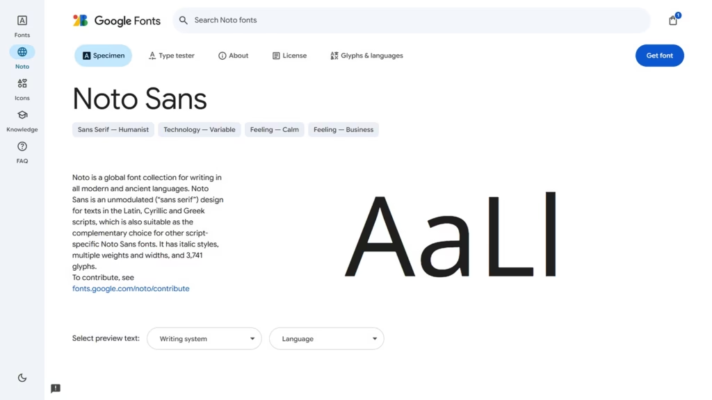
Noto is a versatile font collection designed to support writing in both modern and ancient languages worldwide. It ensures uniformity, readability, and seamless typography across diverse scripts, making it an essential tool for global communication, digital content, and multilingual publishing. With its comprehensive coverage, Noto helps preserve linguistic diversity while maintaining a consistent design.
PT Sans
PT Sans is a modern and versatile sans-serif typeface designed for readability and usability across digital and print media. Created as part of the Public Type project, it supports both Latin and Cyrillic scripts, making it ideal for multilingual applications. With its clean, geometric shapes and balanced proportions, PT Sans is perfect for websites, branding, user interfaces, and editorial design.
Merriweather
Merriweather is a highly readable serif typeface designed for comfortable reading on screens and in print. With its slightly condensed letterforms, moderate contrast, and generous x-height, it balances elegance and legibility. Supporting multiple languages, Merriweather is ideal for websites, books, and editorial design. Its classic yet modern aesthetic makes it a great choice for professional and literary applications.
Ubuntu
Ubuntu is a contemporary, humanist sans-serif typeface crafted by Dalton Maag for the Ubuntu operating system. Designed for clarity and readability, it features smooth curves, open letterforms, and balanced proportions, making it ideal for digital and print use. With multilingual support and a modern yet approachable aesthetic, Ubuntu is perfect for user interfaces, websites, branding, and professional communication.
Bitter
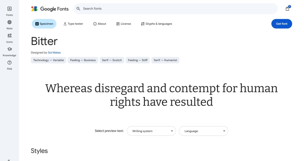
Bitter is a contemporary slab-serif typeface designed for optimal readability on screens and in print. With strong, angular serifs and a balanced structure, it combines a classic feel with modern versatility. Its generous x-height and well-spaced letterforms enhance legibility, making it ideal for websites, books, and editorial design. Bitter supports multiple languages and works well for both body text and headlines.
Conclusion
Google Fonts is essential for web designers and developers looking to enhance website aesthetics and readability. Its extensive library of high-quality, open-source fonts caters to any design style. Integration is straightforward, ensuring consistent typography across all devices and browsers. By leveraging Google Fonts, you can create visually compelling, accessible, and adaptable designs to help your website stand out and resonate with your audience.
Leave a Reply