
In today’s data-driven world, businesses are awash in information. Transforming this raw data into actionable insights is paramount, and this is where data visualization shines. However, the sheer volume and complexity of modern datasets often overwhelm traditional methods.
Enter AI data visualization tools a groundbreaking evolution that not only streamlines the visualization process but also reveals deeper, more nuanced insights hidden within the data. These advanced tools are transforming how we understand and interact with information, enabling everyone from data scientists to business executives to make smarter, faster decisions.
What is an AI data visualization tool?
An AI data visualization tool is an advanced software solution that integrates artificial intelligence with modern visualization techniques to turn raw, complex datasets into clear and insightful visuals. It goes beyond traditional tools by using machine learning algorithms to detect patterns, trends, and anomalies with minimal manual effort.
These tools make data more accessible and meaningful, even for non-technical users. By automating interpretation and recommending optimal visuals, they empower faster, smarter decisions across industries. From forecasting business performance to uncovering hidden insights, AI data visualization tools revolutionize how organizations interact with their data.
The Power of AI Data Visualization
AI data visualization harnesses the intelligence of machine learning to transform raw, complex data into clear, insightful visuals automatically. Unlike traditional methods, AI doesn’t just display data—it interprets it. This means faster pattern recognition, smarter visual suggestions, and deeper insights that might otherwise go unnoticed by the human eye.
The true power lies in its ability to democratize data understanding. Even non-technical users can explore trends, detect anomalies, and make data-driven decisions confidently. From forecasting sales to improving customer experiences, AI data visualization empowers teams to act faster, smarter, and with greater precision in an increasingly data-driven world.
Key Features of AI Data Visualization Tools:
- Predictive Insights: Leverage forecasting and trend analysis powered by AI.
- Live Data Sync: Integrate real-time data with continuous updates and alerts.
- Smart Anomaly Detection: Automatically spot outliers and unusual data patterns.
- Auto-Generated Visuals: Instantly create charts, dashboards, and reports without manual setup.
- Interactive & Custom Dashboards: Drill down into visual data with customizable views and storytelling features.
- Conversational Data Access: Use natural language queries to explore data and get AI-generated summaries or narratives.
In short, AI data visualization tools make data exploration faster, smarter, and more accessible—even for non-technical users.
ThoughtSpot
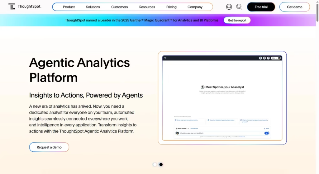
ThoughtSpot is a leading technology company that has revolutionized the business intelligence (BI) and analytics landscape. It empowers users with a search-based interface, making data exploration accessible to everyone—no coding required.
What truly elevates ThoughtSpot is its AI-driven insights, which automatically detect patterns, anomalies, and key trends. This capability helps users uncover opportunities and make proactive decisions, transforming raw data into real-time, actionable intelligence across the organization.
Polymer
Polymer was an open-source JavaScript library developed by Google that aimed to make it easier to build web applications using Web Components. It provided a structured way to create encapsulated, reusable UI components with clean, maintainable code.
A key strength of Polymer was its simplified custom element creation, which allowed developers to define and register new HTML elements effortlessly. This streamlined development, enhanced reusability, and encouraged modular architecture in modern web apps.
Julius

Julius AI is an AI-powered data science assistant designed to make data analysis accessible to everyone, regardless of coding or statistical expertise. It functions like a smart assistant, helping users explore and understand data through a user-friendly interface.
Its powerful use of Natural Language Query (NLQ) allows users to ask questions in plain language—like “What were our top sales last quarter?”—and receive accurate, visual answers instantly. This bridges the gap between data and decision-making.
Explo
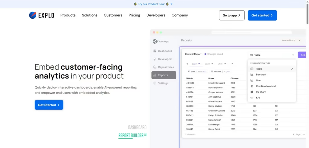
Explo is a specialized embedded analytics platform designed to help businesses deliver customer-facing dashboards and reports directly within their own applications. Unlike traditional BI tools focused on internal use, Explo empowers external users—customers, partners, or end-users—with data insights right where they need them.
Its Self-Service Report Builder is a game-changer, allowing users to create and customize their own reports without developer support. This reduces overhead and enhances user satisfaction through on-demand data access.
Domo
Domo is a cloud-native Business Intelligence (BI) and data platform designed to help organizations of all sizes—from startups to large enterprises—transform raw data into actionable insights. It connects seamlessly with multiple data sources, offering real-time analytics in an intuitive, user-friendly interface.
A key strength of Domo lies in its data transformation capabilities, allowing users to clean, join, and prepare data efficiently before visualization. This ensures accuracy, consistency, and relevance across all analytics workflows.
Tableau
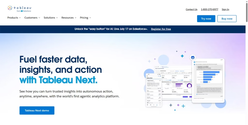
Tableau is a leading data visualization and business intelligence (BI) tool that empowers individuals and organizations to see and understand their data. Its drag-and-drop interface makes it easy to create compelling visuals and dashboards without the need for deep technical expertise.
One of Tableau’s standout features is its real-time analytics capability, allowing users to connect to live data sources and monitor performance instantly. This ensures timely insights and supports faster, more informed decision-making.
Sisense
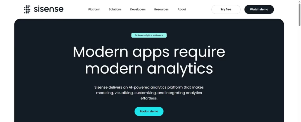
Sisense is a comprehensive Business Intelligence (BI) and analytics platform that empowers organizations to analyze, visualize, and embed data from diverse sources into interactive dashboards, reports, and applications. It offers a flexible and scalable solution suited for businesses of all sizes.
A standout feature of Sisense is its interactive dashboards and visualizations, which allow users to drill down into data, uncover trends, and explore insights dynamically. This interactivity enhances decision-making and promotes data-driven collaboration across teams.
Mammoth
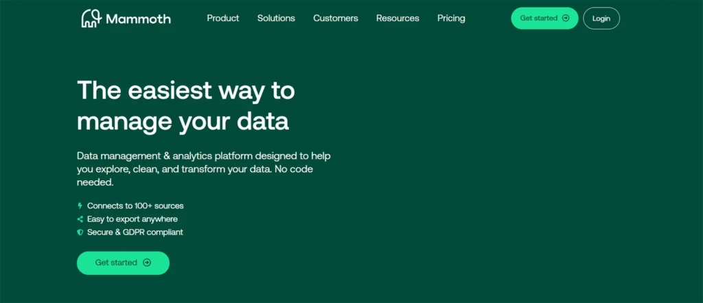
It appears there are a few different entities operating under variations of the name Mammoth AI. Based on the search results, the most prominent one relevant to data is Mammoth (mammoth.io), which focuses on AI-powered data management and analytics, helping businesses unlock deeper insights from their datasets.
A key strength of Mammoth lies in its AI-powered data cleaning and preparation capabilities. It automates the tedious process of identifying errors, inconsistencies, and duplicates—ensuring cleaner, more reliable data for analysis and decision-making.
Infogram
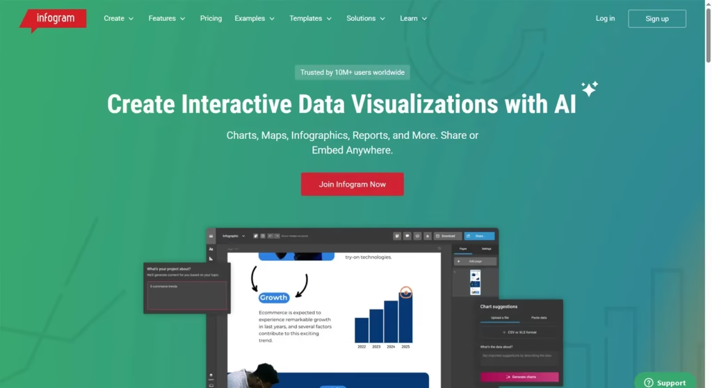
Infogram is a web-based data visualization and infographic platform that enables users to create stunning, interactive charts, infographics, maps, and reports—no coding required. Its intuitive drag-and-drop interface makes it accessible for marketers, educators, analysts, and business users alike.
One of Infogram’s major strengths is its extensive chart and map library, which offers a wide variety of visual formats. This ensures users can represent data in the most impactful and engaging way possible across different contexts.
Grafana
Grafana is a widely-used open-source analytics and interactive visualization web application, primarily designed for monitoring and system observability. It enables users to query, visualize, and explore metrics, logs, and traces across various data sources in a unified dashboard.
A key feature of Grafana is its robust alerting and notifications system. Users can set thresholds and receive real-time alerts via email, Slack, or other channels—ensuring prompt action when critical system changes or anomalies occur.
KNIME
KNIME (pronounced “naim”), short for Konstanz Information Miner, is an open-source platform for data analytics, reporting, and integration. It empowers users to design complete data science workflows through an intuitive, visual interface that eliminates the need for extensive coding expertise.
Its powerful no-code/low-code approach allows both technical and non-technical users to manipulate, analyze, and visualize data efficiently. This accessibility accelerates project development, fosters collaboration, and lowers barriers to advanced analytics adoption across teams.
Prezi
Prezi is a cloud-based presentation software that stands out from traditional slide-based tools by offering a dynamic, zooming canvas. Unlike linear slideshows, Prezi enables users to place content on a single, expansive canvas and navigate freely between topics.
This non-linear navigation is a key advantage, allowing presenters to tailor the flow of information to audience engagement. It supports more interactive, story-driven presentations and helps emphasize relationships between ideas in a visually compelling way.
Conclusion
In conclusion, AI data visualization tools are no longer just an advantage; they are becoming a necessity for any organization looking to extract maximum value from its data. By automating tedious tasks, unearthing hidden patterns, enabling intuitive interaction, and providing predictive insights, these tools empower businesses to transform raw information into a powerful engine for growth and innovation. Embracing these technologies is key to staying competitive in the ever-expanding data landscape.
Leave a Reply