Every year, web design grows and changes with more and more delicate, modern and unique look. I can only imagine that the best is yet to come in 2015. These can develop in terms of shopping, entertainment, business virtually anything. Web design is certainly something that can be included in this category as well. While some of the trends have quickly come and gone there are others that are destined to stay around for a while longer.
Web sites are more interactive with cool navigation and rich media content. We’ve taken a look at some of the biggest and exceptionally web design trends 2015 that are most popular web design trends that will likely make a splash this year. Whether you’re an agency, a designer, or on the client side these trends will help you stay on your toes. Anyway, with that massive list of caveats out of the way, let’s begin.
1. The Parallax Effect
The use of parallax techniques for web design is a relatively new integration and is gaining popularity with many trendy websites and organizations. The term parallax first came from the visual effect of 2D side scrolling video games that used different background image movement speeds to create the illusion of depth during game play. This technique is not new however, this technique has been around for quite some time in the web design community before its recent rise to a trending style.
2. Typography Trend in Web Design
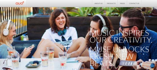
Typography greatly affects usability and the overall aesthetics of the site. Web typography is making its own rules and its own way into history, defining trends to be studied by some future generations. It’s generally unwise to claim there are trends in typography because good typefaces have a very long shelf life and staying power. Keep an eye out for these popular trends, and consider incorporating them into your own designs if they need a typography face lift.
3. Ghost Buttons
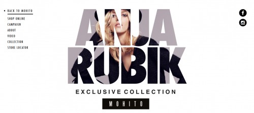
Ghost button is definitely a web design trend of 2015, and now we all know this. Ghost buttons are trendy, but this doesn’t mean they are complex in terms of design. The very simple design of empty buttons allows even novices to use them for their projects. Ghost buttons can be found on sites with large background images and websites that take a more minimalist approach. A ghost button is considered to be potentially popular. So, open the following design and keep tracking of your eyes movements.
4. Custom Photography
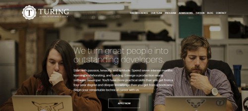
Custom web design is becoming more and more popular. Custom photography is a great way to grab the attention of website visitors, and offers users something fresh, and unique, thereby making your website stand out from competitors. This custom photography website design is primarily focused around showcasing an archive of amazing family and children related photography. Which brings us to another notable trend below.
5. Flat Design
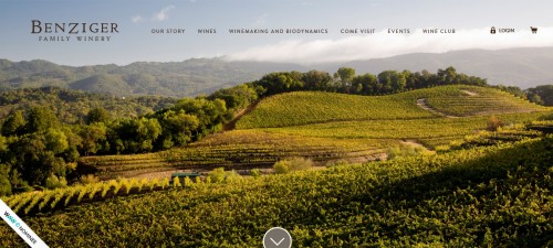
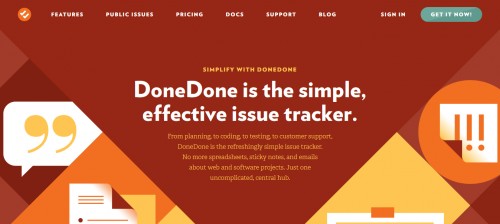
Flat web design is the most trendy topic of the year 2015. Flat design is mainly the term given to the style of design in which elements lose any type of stylistic characters. The elements are meant to appear as if they’re lying flat on a single surface. Hence the name flat design. The simple styling allows flat design to look good across various applications and screen sizes. Here below this is the best example for you of flat design.
6. Hidden Menu
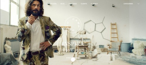
The hidden menu is usually done by a newbie programmer who learned how to hide and show objects, or wants to be sophisticated and clever. These hidden menus will only become visible when the visitor is ready to move on and clicks the appropriate icon. Hidden menus are the best for responsive web design which is widely used for small screens currently. If you wish to hide your navigational menu using this web design trend, click on the links below pointing to resources and design inspirations.
7. Upwardly Responsive
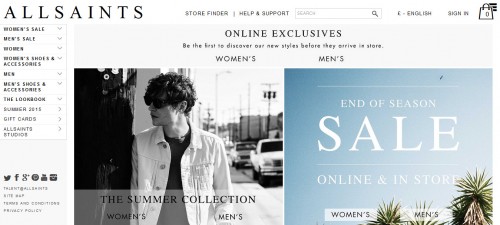
Responsive design has been a hot trend in the past couple of years, with plenty of brands adapting their websites for smartphone and tablet users. Upwardly responsive web design is particularly important when optimizing your website’s layout for people using much larger screens, often with very high resolutions. Here is an example below.
8. Card Design
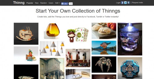
Cards are ubiquitous in web design these days, and the trend seems to be catching on. Cards are fast becoming the best design pattern for mobile devices. In fact, the revered web trinity of Google, Twitter, and Facebook are all doing it. Card design is the perfect way to make your design glance-able, user-friendly, and responsive. They definitely deserve your consideration.
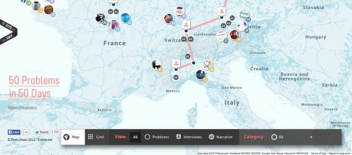
9. Integrating Google Maps
Google maps can be a great way to display useful information for users while creating a strong and unique user experience. Creating Google maps based website, however, can be a real challenge for web designers. A lot of websites following this trend build their functional and visual idea around a map concept. Here is an example that serve as proof.
10. Material Design
Material design is a design language that challenges to create a visual language for users that synthesizes the classic principles of good design. Material has physical surfaces and edges. Seams and shadows provide meaning about what you can touch. Whether you plan to design a website template, a mock-up, an app, or a device interface I hope this example will guide you to an impressive result.

Leave a Reply